Market Supply Curve
The market supply curve is a graphic representation of the market supply schedule. Market supply schedule is a list of total quantity of a commodity offered for sale by all sellers in the market at different possible prices in a given time period. It is found by adding the individual supply schedules of all sellers present in the market at a particular time period.
For the sake of simplicity, we assume that the market consists of two sellers, Ananga and Ananta. In the following table we have derived the market supply schedule from the individual supply schedule.
Monthly Market Supply Schedule for Rice
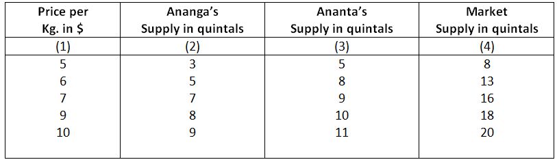
In the above table Ananga’s supply was 3 quintals and Ananta’s supply was 5 quintals when price per kg. of rice was $5. Total market supply was 8 kg indicated in column 4. When price rises to $6, Ananga’s supply increased to 13 quintals, Similarly we can derive other price-quantity combinations by joining the quantities indicated in Cols, 2 and 3. It is seen that like the individual supply schedule, the market supply schedule shows the direct relation between price and quantity supplied.
The market supply curve is the horizontal summation of the individual supply curves. The following diagram depicts the derivation of market supply curve from individual supply curves.
Derivation of Market Supply Curve
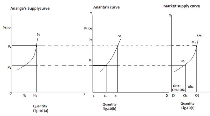
In the above diagram, Fig. 10(a) represents Ananga’s supply curve and Fig. 10(b) represents Ananta’s supply curve, When price was OP1, Ananga’s supply was ON1 and Anantas supply was OK1. Total supply was ON1+OK1 = OQ1. When price rises OP2 supply rises to ON2=OK2= OQ2. By joining the price-quantity combination in Fig. 10 (c), we get M1 and M2, points and joining both, we get Sm, the market supply curve which slopes upwards to the right.