Frequency Polygon
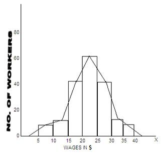
This graph is drawn in the form of a smooth curve by joining the and points on the top of all the rectangular bars of a histogram. In practice, however, it is drawn directly by joining the co-ordinating points of the mid – values of the class intervals, and their corresponding frequencies. Such a graph is generally drawn with the presumption that the frequencies of all the class intervals are evenly distributed. As such, this graph can be drawn only when all the class intervals are of equal magnitude.
It is to be noted that the two tails of the curve are extended in both the sides to touch to the base at the mid-points of the adjacent empty class intervals. This way, the area of the polygon remains the same as that of the histogram. The following illustrations will show how a frequency polygon is drawn.
Illustration:
Drawn a frequency polygon from the following data:
![]()
Solution: Frequency polygon
(Showing weekly wages paid to the workers)