Scatter Plots
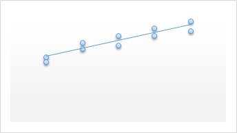
Scatter Diagram or Plot is a graphical representation of relationship between two quantities variables, and a trend line is a line that provides an approximation of the relationship.
A graph of bivariate data in which the independent variable is on the horizontal axis and dependent is on vertical axis.
Consider the following example for scatter Diagram
| Observations | X | Y |
| 1 | -22 | 22 |
| 2 | -33 | 49 |
| 3 | 2 | 8 |
| 4 | 29 | -16 |
| 5 | -13 | 10 |
| 6 | 21 | -28 |
| 7 | -13 | 27 |
| 8 | -23 | 35 |
| 9 | 14 | -5 |
| 10 | 3 | -3 |
| 11 | -37 | 48 |
| 12 | 34 | -29 |
| 13 | 9 | -18 |
| 14 | -33 | 31 |
| 15 | 20 | -16 |
| 16 | -3 | 14 |
| 17 | -15 | 18 |
| 18 | 12 | 17 |
| 19 | -20 | -11 |
| 20 | -7 | -22 |
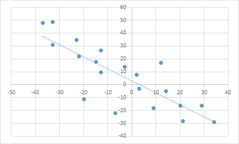
To Construct the Scatter Plot in excel.
Step 1: Select the data set in excel
Step 2: Click the insert tab on ribbon.
Step 3: In the chart group select Scatter
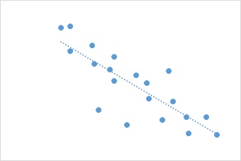
A trend line can be added to the scatter diagram as follows.
Step 1: Position the mouse pointer over any data point in the scatter diagram and right click to display a list of options.
Step 2: Choose Add trend line.
Types of relationship depicted by scatter diagrams.